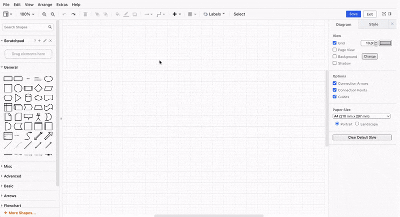
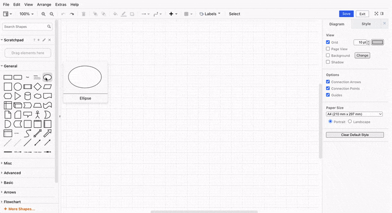
Free Draw
LeanIX Free Draw enables you to create custom diagrams and visual representations of their enterprise architecture. It offers the flexibility to design diagrams from scratch using different shapes, symbols, and connectors.
Free Draw diagram allows you to visualize and explore dependencies among various architectural elements. You can create custom visualizations, such as organizational hierarchies and business capability maps, to provide a tailored view of the architecture. It enables you to dive deep into specific architectural elements, conduct detailed investigations by zooming in on specific areas, and explore relationships and dependencies with focus. In the section Using diagrams for assessment, you will gain further insight into how diagrams can be utilized for evaluating architecture.
If you are a LeanIX customer or partner using the former LeanIX Diagram editors, please refer to Former Diagrams Editor documentation.
Accessing Free Draw
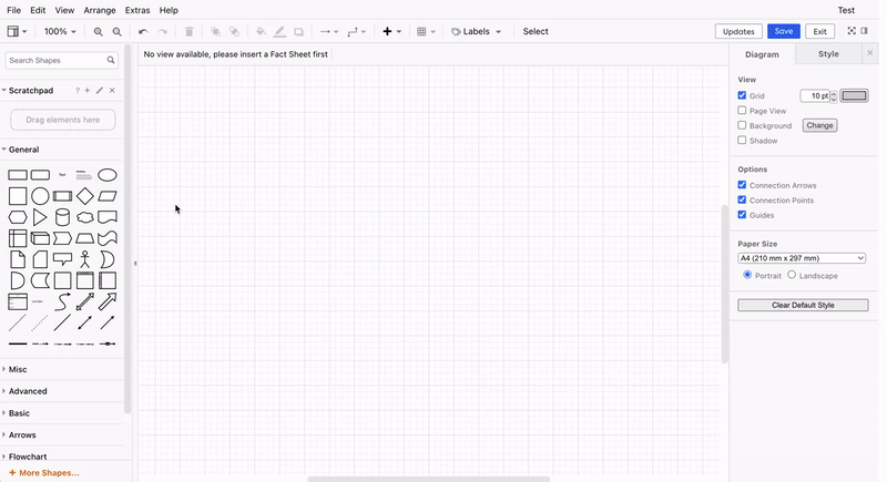
To begin creating diagrams in the Free Draw, log in to your workspace and follow the following steps:
- Navigate to the Diagrams section by clicking on the Diagrams tab from the top navigation bar.
- Click on + New Diagram button to open the panel of available diagram editors.
- Select Free Draw from the available diagram types to open the editor and start creating the diagrams.
Note
To prevent potential data loss, please press Save to create a working copy directly after cretaing a new diagram
To manage the Diagrams better and group them into classifications, users with Admin rights can utilize the Collections feature. This feature introduces individual categories among Reports and Diagrams. Check out the Collections page to learn more on how to manage these categories.
Hint
You can save time by importing architecture templates and example diagrams from draw.io to kickstart your project.
Using Free Draw
This section provides guidance on using Free Draw to create architectural models. It explains how to incorporate Fact Sheets into the diagram, linking them to specific shapes and establishing relationships between different elements.
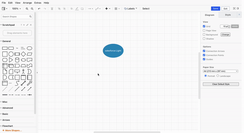
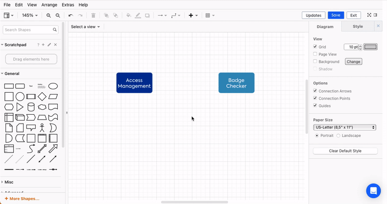
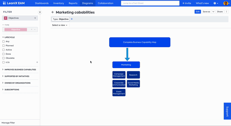
Include Fact Sheets as shapes in the diagrams
In order to include Fact Sheets from the Inventory in your diagrams, do the following:
- Click on "+" icon in the toolbar. (alternatively, you can also right-click anywhere on the canvas and choose Insert from Inventory).
- A window will open showing all the Fact Sheets from the Inventory. Make use of filters to choose the Fact Sheets needed, either individually by using the check box to the left and clicking Insert selected or by choosing a specific Fact Sheet type through the filter and then clicking Insert all.
- Selected Fact Sheets are now presented in the canvas. You can easily adjust their styling, position, and alignment by selecting and moving them around.
Linking and Unlinking Fact Sheets to shapes in diagrams
To link Fact Sheets from the Inventory into existing shapes in your diagrams, do the following:
- Right-click on the shape you want to link. A context menu will appear; click on Link a Fact Sheet.
- The Fact Sheet quick search will appear, which shows you a list of all existing Fact Sheets in your workspace. Scroll to choose one or start typing to find the Fact Sheet you need.
- After selecting a Fact Sheet from the quick search, if the selected shape has no background color, the linking process will apply the Fact Sheet's color and its name as the label in the shape.
- You can unlink the Fact Sheet from the shape by right-clicking on the shape and clicking on Unlink Fact Sheet.
The shape must have been already linked to a Fact Sheet in the first place, or the Fact Sheet must have been inserted as a shape in order to unlink Fact Sheet and shapes.
Once the Fact Sheet is unlinked from a shape, the shape will keep the label and color it already had.
Changing and Opening linked Fact Sheets
To change the linked Fact Sheet, you can unlink a Fact Sheet and then link a new one again or change the linked Fact Sheet by doing the following:
- Right-click on the already linked shape and select Change linked Fact Sheet.
- From the Fact Sheet quick search, you can either scroll to look for another Fact Sheet available in your workspace or start typing to find the Fact Sheet you need.
- After selecting another Fact Sheet from the quick search, the label and color will be updated with the newly linked Fact Sheet.
Linking a Fact Sheet to a shape will allow you to open the Fact Sheet from the canvas. The linked Fact Sheet can be opened by right-clicking on the shape and selecting Open Fact Sheet. The Fact Sheet will open in a new tab.
Creating new Fact Sheets and relations from within the Canvas
In Free Draw, you can create new Fact Sheets and new relations between Fact Sheets directly within the diagram.
- Right-click on any shape that is not yet associated with a Fact Sheet and select Create new Fact Sheet. Then select the Fact Sheet type you would like to convert your shape to.
- Edit the text inside the shape. The text that you provide within the shape will serve as the new Fact Sheet name.
- To add your newly created Fact Sheet to the Inventory, click on the Updates button in the top right corner. Select the Fact Sheets you want to create, then click Apply updates.
- The new Fact Sheet has now been added to the Inventory, and a confirmation message is displayed.
- A default naming scheme will be applied to the shapes if no custom name is provided. i.e. Business Capability 1, Business Capability 2, Application 1, Application 2 etc.
- A + icon will be displayed in the top right corner of the newly created Fact Sheet, and it will remain there until the Fact Sheet is added to the Inventory through the Updates function.
Fact Sheet and Relation Creation feature are only available in Free Draw. Although we envision enabling the creation of Applications and Interfaces directly from the Data Flow as well, this is currently not yet available.
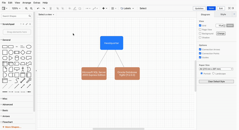
If you have more than one Fact Sheet in the diagram, you can establish relations between them by joining them with any connector shape (e.g., arrows, dotted lines, etc.).
- Draw a connector shape between two Fact Sheets shapes.
- Right-click on the connector shape and select Create new relation. Then select a relation type you would like to establish.
- To add your newly created relation to the Inventory, click on the Updates button link in the top right corner. Select the relations you want to create, then click Apply updates.
- A new relation has now been added to the Inventory, and a confirmation message will be displayed.
Types of Connections between Fact Sheets
The types of connections that one can establish between Fact Sheets will depend on the types of Fact Sheets that they are trying to connect.
Listed below are some examples of the types of relations that can be established when joining different types of Fact Sheets:
Connecting Business Capabilities with Applications:
- Requires
- Requires by
- Business Capability to Application
Connecting Business Capabilities with Organizations:
- Requires
- Requires by
Connecting Business Capabilities with Business Contexts:
- Requires
- Requires by
- Business Capability to Business Contexts
Expanding Interfaces
Expanding Interfaces is a new feature with which you can understand the providing and consuming interfaces of an application directly within Free Draw and Data Flow.
- When the mouse pointer hovers over a shape that is linked to a Fact Sheet, semi-transparent arrows will appear on all sides of the shape.
- Hover over any of those arrows, depending on the direction you want to expand your diagram, to see the Interfaces of the respective Fact Sheet in a suggestion box.
- Click on the suggestion box to include the Interfaces in the diagram.
Arrows and not boxes then represent Interface Fact Sheets. You can still use Show dependencies and Drill-Down to get Interfaces as boxes in the regular fashion. The feature just adds a way to go from Application to Application directly.
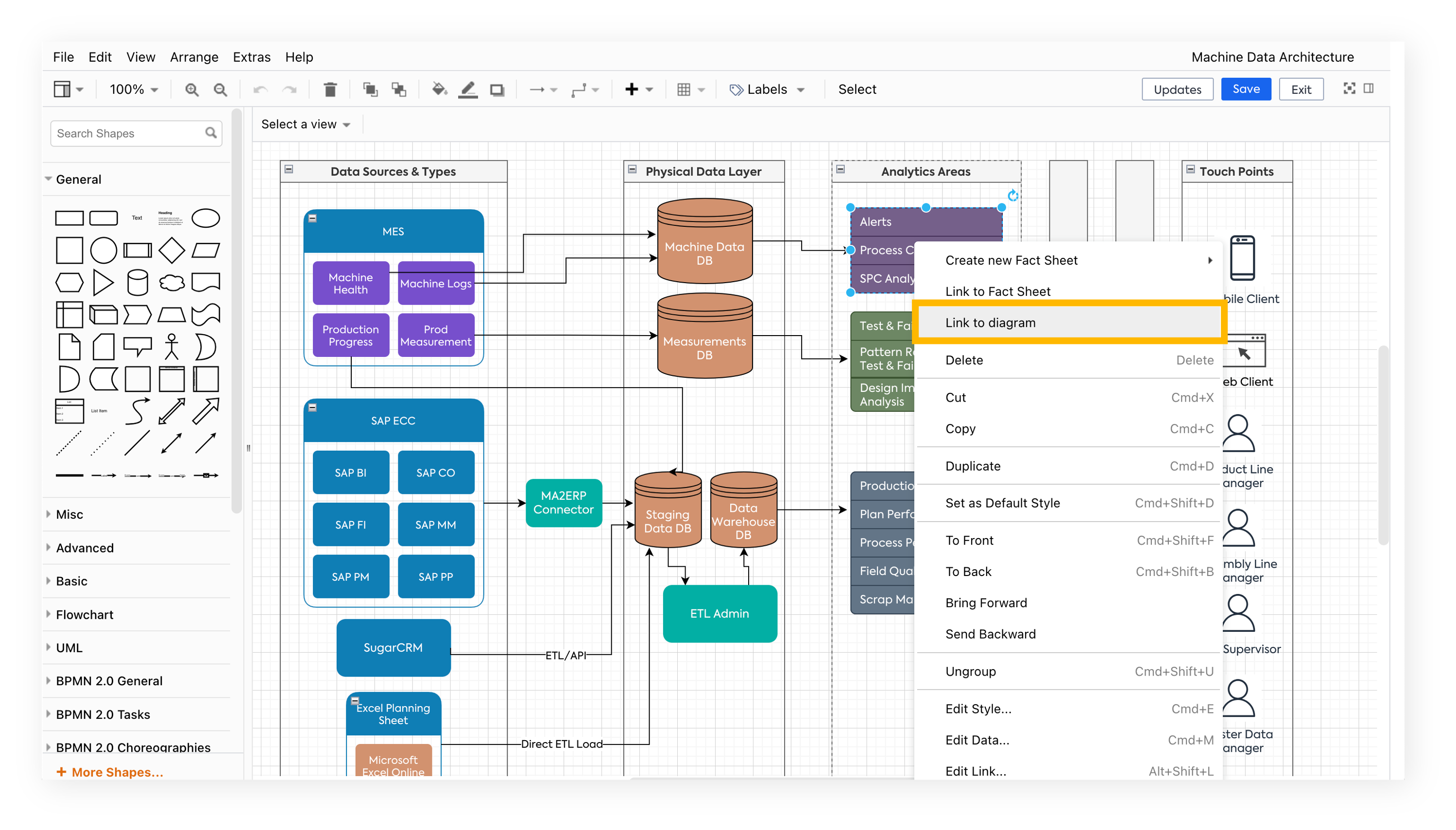
Linking diagram to other diagrams
This feature enables you to manage large and complex architectural diagrams effectively. You can create multiple diagrams with varying levels of detail and link them to navigate across different abstraction layers.
In edit mode, you can link a diagram directly to a shape through a hyperlink. Clicking the shape opens the linked diagram in a new browser tab.
However, the following conditions should be kept in mind:
- You can not link a diagram to a shape if the shape is already linked to a Fact Sheet.
- You can not link a diagram to a shape that is a 'connector.'
- A shape can be linked to only one diagram.
To link a diagram to a shape, do the following:
- Right-click on the shape you want to connect the diagram to
- Select Link to diagram from the menu
- The diagram quick search will appear, which shows you a list of all existing diagrams in your workspace. Scroll to choose one or start typing to find the diagram you need.
To unlink a diagram that is linked to a shape, do the following:
- Right-click on the shape to which the diagram is connected
- Select Unlink diagram
Similarly, you can change or open the linked diagram by selecting Change diagram or Open diagram from the right-click menu.
In the view mode, clicking on the shape takes you to the linked diagram, and the navigation happens in the same tab. To return to the previous diagram, you can use the back arrow next to the title of the diagram.
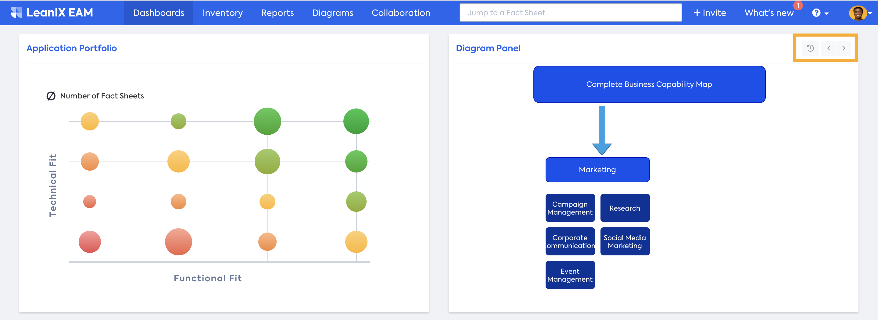
When you have a Dashboard panel for your diagram, you can effortlessly navigate between linked diagrams using the Back/Forward buttons. The 'History' button allows you to browse through previously visited diagrams.
Linking Diagram to Fact Sheet
Linking diagrams to fact sheets enables you to access relevant diagrams directly from the fact sheet. You can link the diagram in the Resources tab of the fact sheet. For detailed instruction, see Store Resources on Fact Sheets. Linked diagrams are then visible both in the Resources tab, as well as on the fact sheet sidebar.
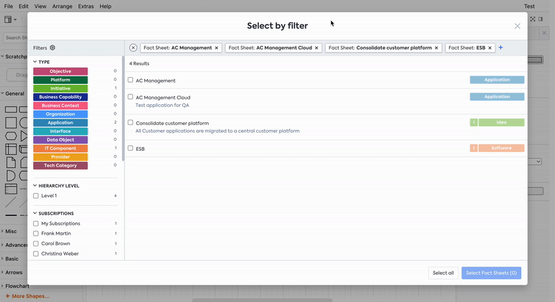
Select by filter
The Select by Filter feature allows you to easily select Fact Sheet shapes on the canvas based on specific criteria. This can be done using the Select button in the toolbar or by right-clicking on the canvas and choosing the “Select by Filter” option from the menu.
Using the Select button:
- Click the Select button in the toolbar.
- A modal will appear where you can apply filters to select your desired Fact Sheets.
Using the right-click menu:
- Right-click on the canvas.
- Choose the Select by Filter option.
- A modal will appear where you can apply filters to select your desired Fact Sheets.
You can insert images in the Free Draw editor, but please note that the image may not exceed a file size of 1 MB.
Using diagrams for assessment
Diagrams effectively evaluate architecture by offering multiple perspectives, detailed investigations, and visualization of elements, relationships, and dependencies. They enable you to easily identify connections between Fact Sheets and facilitate focused exploration within the architecture.
"Updating Diagram" spinner
In the view mode, "Updating diagram" spinner icon indicates data is currently loading for views and/or an automatic update is in progress in the backend. Once the update concludes, the spinner disappears, and the view toolbar becomes functional again. Throughout the spinner display, other functionalities such as zooming, changing the viewport, clicking on diagrams or Fact Sheets, and using filters remain accessible.
This allows users to swiftly view and interact with diagrams on the dashboard and in the view mode without waiting for the backend updates to finish.
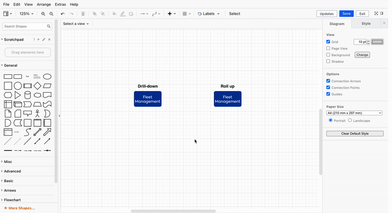
Dependencies, drill-downs, and Roll ups
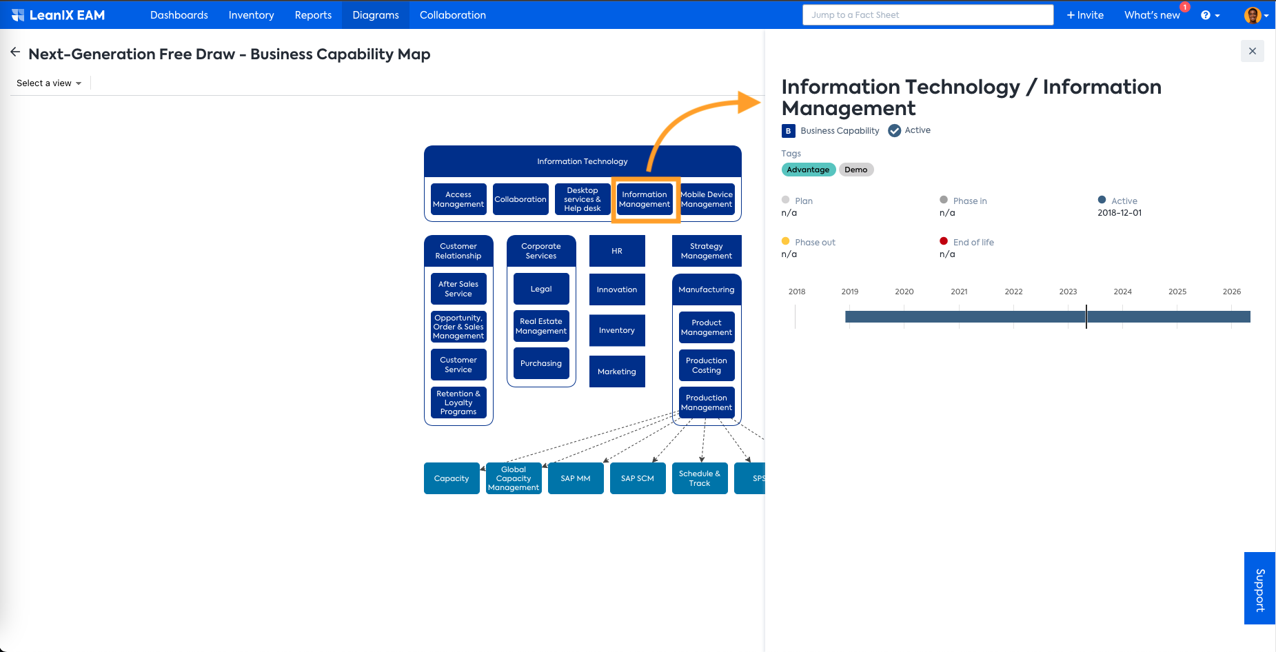
For example, a user may want to visualize various dependencies of an application, including direct and indirect dependencies. This goes beyond just integrations with other applications, as one can explore dependencies such as data objects consumed or provided, supporting IT components, associated projects, the business capabilities served by the application, and more. Learn how to do that in the section below.
To show the dependencies of Fact Sheets in a diagram, follow this short instructional example:
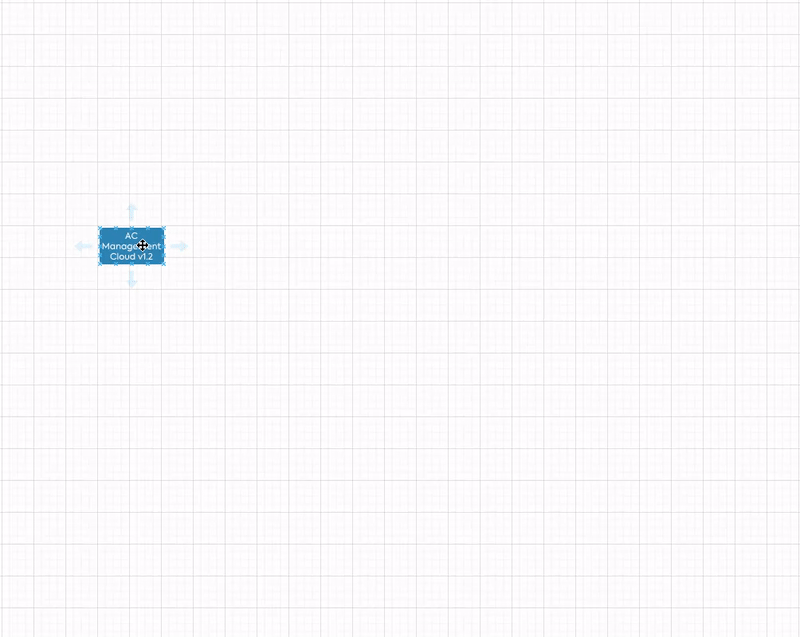
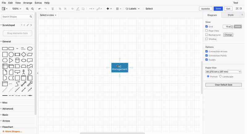
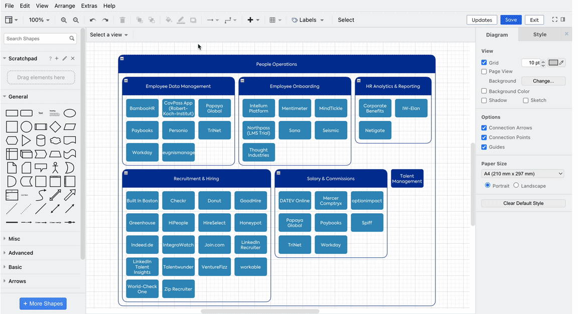
- Right-click on the shape for which dependency has to be visualized. Here, in this example, an application called AC Management.
- From the context menu, select Show dependency.
- Depending on the Fact Sheet type and the specific Fact Sheet linked to that shape, one will see available dependencies.
- Click on the needed relation to visualize and explore.
The example illustrates how you can analyze the direct dependencies of an Application: the Business Capabilities it supports, the IT Components and Projects it relies on, and the Data Objects it utilizes, etc. Additionally, you can also visualize indirect dependencies. In this instance, we determined which other Applications utilize the Data Object Employee Time and thereby gained insight into indirect dependencies of the Application AC Management.
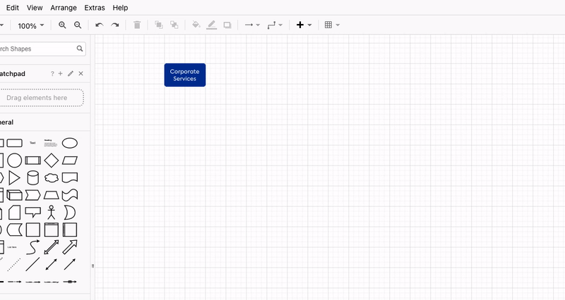
A diagram is also useful for you to create custom visualizations that meet specific requirements or preferences. This can include creating organizational hierarchies, business capability maps, or other custom representations that provide a clear and tailored view of the architecture. For instance, if you want to visualize the structure of a specific business capability and identify the applications used within its child business capabilities, the drill-down functionality will be useful. It allows you to delve deeper into the hierarchy and gain insights into the relationships between different elements.
Follow this short instructional example to learn how to show dependent Fact Sheets using the drill-down function.
- Right-click on the shape for which dependency has to be visualized. Here, in this example, Business Capability Corporate Services.
- From the context menu, select Drill Down.
- Depending on the Fact Sheet type and the specific Fact Sheet linked to that shape, one will see available drill-down options.
- Click on the needed relation to visualize and explore.
Roll-up is similar to drill-down in that it helps visualize relations in a structured manner. However, it works conversely compared to drill-down. In roll-up, the selected Fact Sheets are placed inside a bucket, as shown below.
Relations with later "Active By" date and active in the past.
Please be aware that you will only see relations that are currently active when creating a diagram. Relations that are not yet active or were active in the past won't be displayed. This becomes particularly evident when creating a Data Flow diagram and wondering why only some Interfaces are shown. In such cases, double-check if there is a future "Active By" date set for the relation.
Apply Labels
Labels are a new feature that allows you to improve representation and understanding. In the editor, you have the flexibility to add and modify Fact Sheet labels in both Free Draw and Data Flow diagram types. Additionally, in Data Flow diagrams, you can also adjust labels for Interface connections.
To change the label for a Fact Sheet shape, follow these steps:
- Click on the Labels menu, which is located in the top toolbar.
- A drop-down list of Fact Sheet types will appear. Select the Fact Sheet type for which you wish to adjust the label by clicking on it.
- Once you click on a Fact Sheet type, a sub-menu will be displayed, presenting available labels for that Fact Sheet type.
- Click on the desired label from the sub-menu. All corresponding Fact Sheets in the diagram will be updated with the chosen label.
Please note:
- Only one label can be selected for each Fact Sheet type.
- If a Fact Sheet shape does not possess the selected label, the full name will be displayed instead.
Applying and aggregating views
You can choose various views, similar to Reports. Views are essentially attributes or relations, which are represented through a color-coded visualization. Each view provides a unique perspective on the data, enabling the user to gain better insights. Check our Report views documentation to understand the different insights you can gain from applying views.
The view toolbar at the top of the canvas becomes active whenever there is at least one Fact Sheet in the diagram. Select the needed view from the drop-down menu. After selecting a view, the view colors will be applied to the related Fact Sheets, and the view legend will be displayed above. When the diagram is saved, the view will also be stored.
In the views menu, one can also select Fact Sheet Colors, which will revert the color of the shapes to respective Fact Sheet type colors as defined in the Meta Model.
For views on diagrams, it is possible to change the aggregation of the selected view. Aggregations can only be applied to views of fields that are either Fields on relations or Fields on related Fact Sheets.
By default, the aggregation configured in the Meta Model is used. Also, note that aggregations only apply to a set of data. If there is only one relationship to a Fact Sheet in the diagram, the view won't change because the resulting value is the same.
In the example below, you see the Organization Headquarter with two relations to IT Components. The view is set to Used IT Components: Technical Fit. The first IT Component’s Technical Fit is set to Unreasonable, and for the other, it is set to Adequate. Since the default aggregation is configured as Minimum, the Fact Sheet Headquarter gets the color that represents Unreasonable. When aggregation is set to Maximum, the Fact Sheet Headquarter gets the color that represents Adequate.
While aggregating the view, it is possible to select one specific Fact Sheet. When a Fact Sheet is selected, only relations to this Fact Sheet are considered for the view.
In the example below, the view Organization / Business Capabilities: Pace Layering is selected. This view uses a relation to the Fact Sheet type Business Capability. Therefore, you can select one of the Business Capability Fact Sheets. Then, using the option Select a related Business Capability, you choose a specific Fact Sheet. Now, the view is calculated, taking into account all relations to that particular Fact Sheet.
More generally, this functionality is supported for any Single Select, Double, and Integer fields on relations or fields on related Fact Sheets.
Fact Sheet Side Panel
The diagram now includes a new Side Panel that allows you to view detailed information about a Fact Sheet directly from the diagram.
When a user clicks on a Fact Sheet in the diagram, a Side Panel appears with all relevant information about that particular Fact Sheet, including its name, type, tags, and lifecycle.
The Side Panel does not show all the relations a Fact Sheet has, only those that are present in the diagram via drill-down, show dependencies, and expanded interfaces.
Further, you can navigate from the Fact Sheet Side Panel to that particular Fact sheet by clicking on the name of the Fact Sheet. It opens the Fact Sheet in a new tab.
Filtering on diagrams
The filter functionality available in the diagrams is the same as that of the Find Fact Sheets feature in the Inventory. You can apply filters through the filter bar at the top of the filter facets on the left side, which becomes visible when you move the mouse pointer to the left side of the window. This feature allows you to focus on relevant Fact Sheets and relationships within the diagram, excluding unrelated elements.
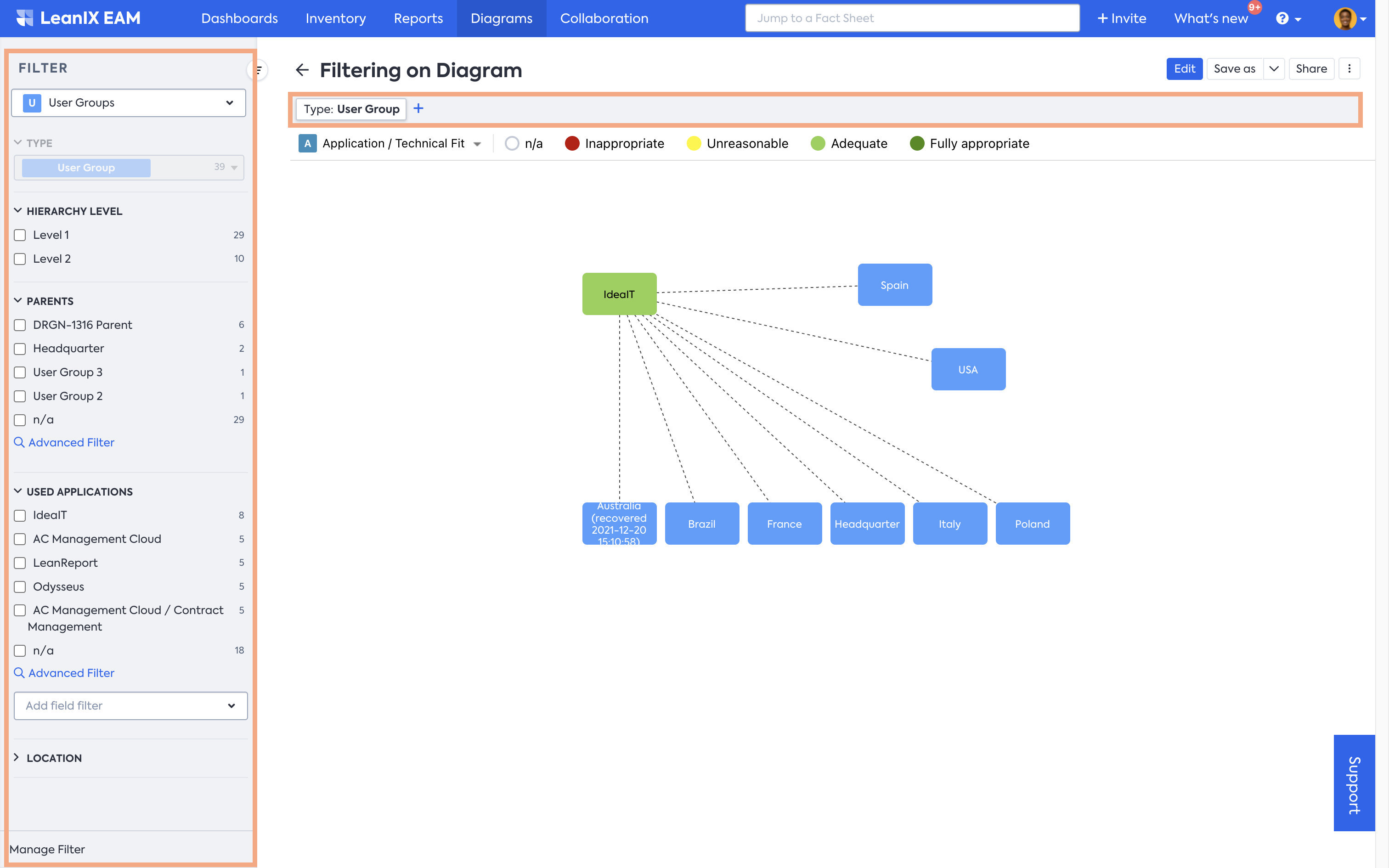
Filtering Behavior
When filters are applied to a diagram:
- Only Fact Sheets and relations that match the filter criteria are visible.
- Non-matching Fact Sheets are completely hidden from the canvas.
- Edges (relations) are hidden if any of their endpoints are hidden due to the filter.
- Pending Fact Sheets are always hidden.
- Ordinary shapes outside of Fact Sheet containers remain visible on the canvas.
Saving Applied Filters
You have the option to save your configured filter settings and applied views:
View Mode: Click the "Save" button to retain the current filter and views setup.
View Mode: Alternatively, choose "Save As" to save the current filter and views setup with a new name.
Edit Mode: No filters are applied, providing an unfiltered overview of the diagram.
Please note that when switching between edit mode and view mode, any unsaved filter adjustments will be reset to their previous state.
Applied filters in exported diagrams
When you export a diagram, the applied filters are preserved. Applied filters provide a consistent and targeted viewing experience for recipients of the exported diagram.
Applied filters in dashboard widgets
The applied filters also persist within dashboard widgets. When you add a diagram as a widget on a dashboard, any filters you have applied will be retained.
Updates from Inventory
Diagrams always show the view the way it was saved last time. This might differ from the current view of the architecture if changes to the architecture happened after the diagram was saved. It can be refreshed by making use of the Updates feature.
In this section, a few points are outlined regarding the different kinds of behavior to expect when attempting to synchronize Free Draw diagrams with the Inventory data in edit mode.
The following kinds of updates could be present in the diagram whenever the Free Draw editor checks for updates:
- Fact Sheets that have been archived are marked for removal.
- Fact Sheets that have a change in their label are marked for updates.
- Fact Sheets that have a different view color in the diagram when compared to the data from the Inventory are marked for an update.
- Relations in the diagram that are no longer valid (relation expired, one of the connecting Fact Sheets has changed, etc.) are marked for removal.
- Collapsed Interface relations that are no longer valid (change in the connecting interface between applications or any other difference in the relation) are marked for removal.
- Collapsed Interface relations that have a different lifecycle phase are marked for an update.
Whenever any of the situations listed above are present in your diagram, you will be presented with icons over those shapes. Hovering over them will give you a tooltip with a small description of what the update actually is.
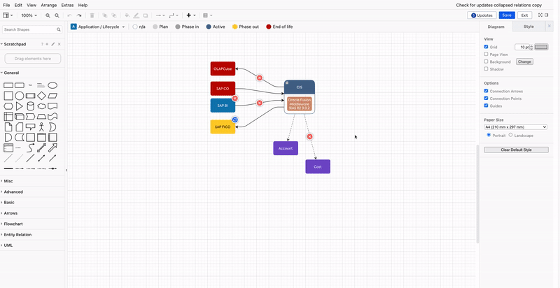
The Updates button at the top right corner also shows a counter with the number of updates present in the diagram.

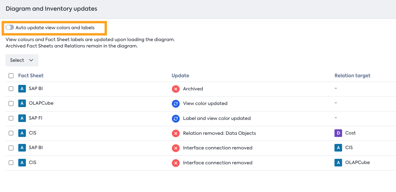
Clicking on the Updates button takes you to a modal that shows the details of all available updates in the diagram. Toggling on the Auto update view colors and labels removes from the modal all updates related to updating fact sheet view colors and labels. This setting is enabled by default on new diagrams but can be turned off and on as needed.
Exporting diagrams
The diagrams can be exported to other formats such as PDF, SVG, PNG, HTML embed code, and XML file, which is compatible with draw.io. Check the documentation on Exporting diagrams for more details.
Updated 15 days ago